Fonts
for
a
progressive
future.
Fonts for people fighting for a better future. Free for all non-commercial use.
Fonts are the single most important tool for making a strong visual identity (come at me, photographers/
Back in 2013, I was making graphics for a project run mostly by volunteers. Being a designer, I wanted to use all the nice professional fonts I was accustomed to, but I immediately hit a roadblock — there was no budget to pay for other volunteers to use those fonts.
So I decided that if the good-looking, freely-distributable fonts I wanted didn't exist (the free font scene was especially bleak in 2013), I was gonna have to make them myself.
If you're an activist, an academic, or anyone just trying to make this world a better place for humans to live out our lives, please take these fonts and use them for whatever you need. They're for you.
In Use
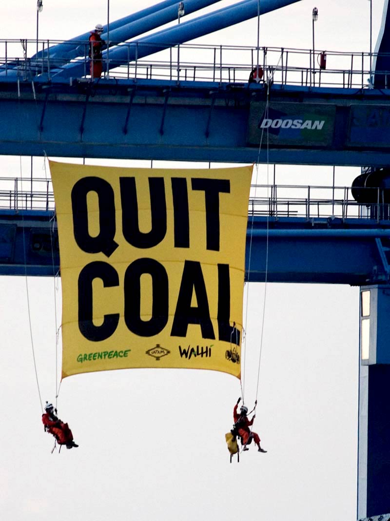
Greenpeace climbers hanging a massive 'Quit Coal' banner from machinery in Cirebon, Indonesia. Credit: Greenpeace
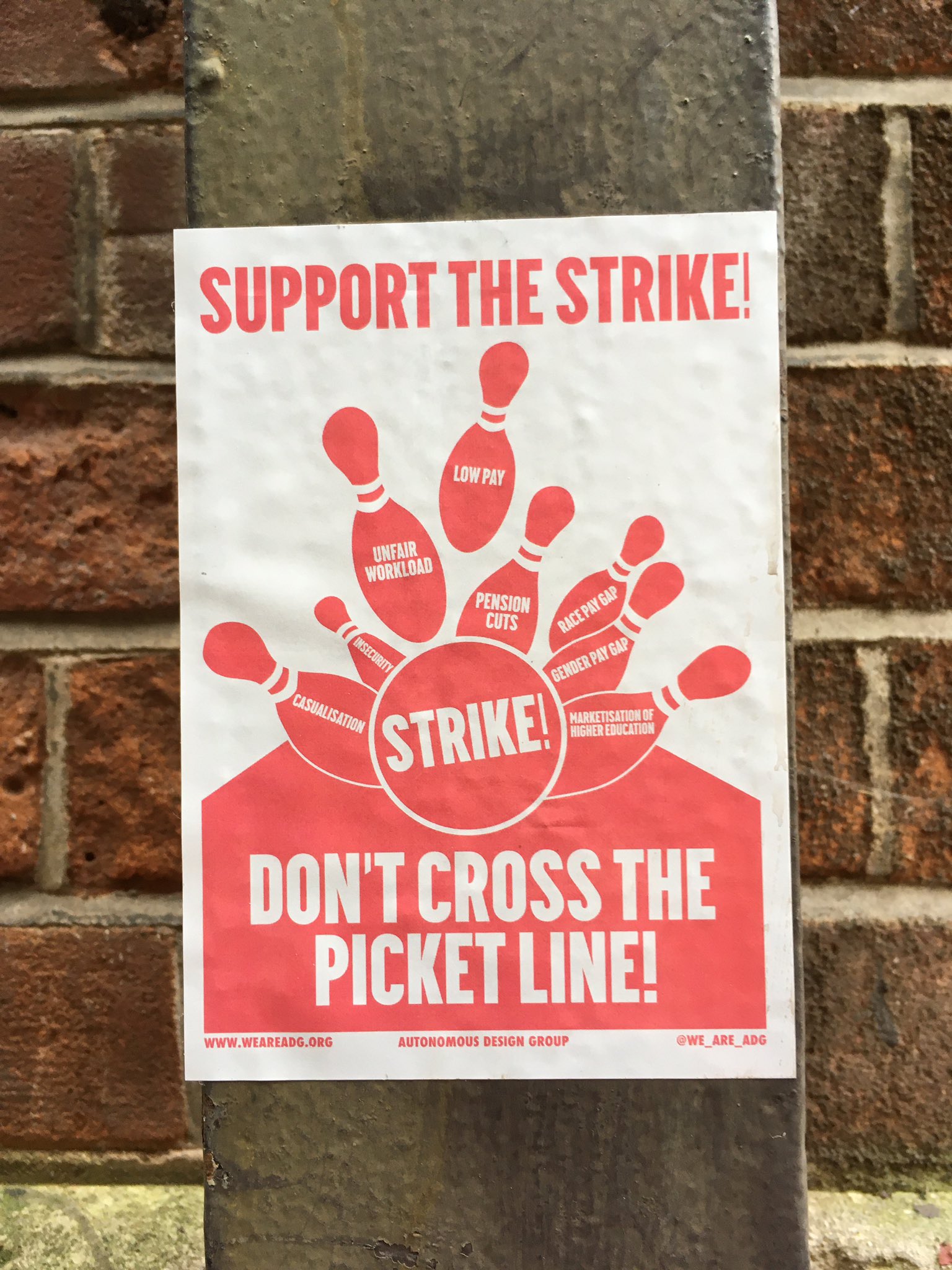
Posters supporting the labor strikes in the UK Credit: Autonomous Design Group
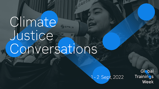
Invitation to a series of talks about climate justice, part of a the Global Trainings Week organized by 350.org Credit: 350.org

Graphics from the New York City chapter of Democratic Socialists for the Tax the Rich campaign. Credit: NYC DSA
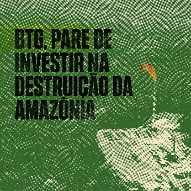
Posts from people in Brazil fighting against the corporate destruction of the Amazon Credit: 350 Latin America
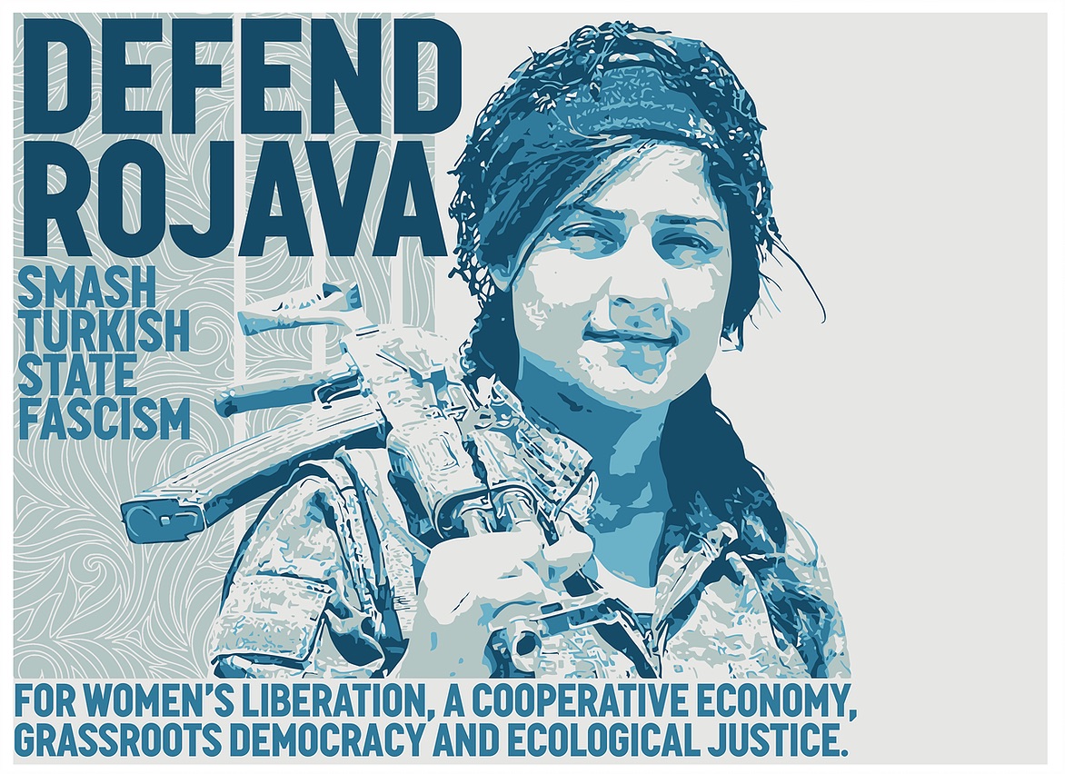
Poster supporting Rojava against the state-sponsored violence of Turkey against Kurds in Syria. Credit: Unknown
Jane Fonda delivers a speech in Canada as part of the Jobs, Justice and Climate Rally. Credit: 350 Canada
Fonts
Clack
About Clack
Clack is a monospace typeface inspired by typewriter typefaces like those found on the IBM Selectric. Perfect when you need a font that blends utilitarian sturdiness with vintage warmth and personality.
Clack features a full range of weights all the way from thin to black, as well as a full set of italics. A set of variable fonts is also included.
Details
- Released 2023.
- Available under a Creative Commons Non-Commercial Reuse license.
- Supports over 100 Latin-alphabet languages.
License Summary*
- You may copy and redistribute these fonts in any medium or format.
- You may modify, adapt, and build upon the fonts as you see fit. If you distribute any modified versions you create, they must be distributed under this same license.
- You may not use the fonts for commercial purposes without explicit prior written authorization.
*The above is a summary of, and not a substitute for the license. Read the full license here.
Union Gothic
About Union Gothic
Union Gothic is a display typeface that ranges from extremely narrow to ultra wide. It's great for headlines, signs, banners — any place where you need to squish and stretch your text to fit exactly the shape you need.
It was made to test the limits of what you can do with a variable font, to see if it's possible to have a typeface that slides seamlessly from one extreme to another.
Details
- Released 2023.
- Available under a Creative Commons Non-Commercial Reuse license.
- Supports over 100 Latin-alphabet languages.
License Summary*
- You may copy and redistribute these fonts in any medium or format.
- You may modify, adapt, and build upon the fonts as you see fit. If you distribute any modified versions you create, they must be distributed under this same license.
- You may not use the fonts for commercial purposes without explicit prior written authorization.
*The above is a summary of, and not a substitute for the license. Read the full license here.
Mort
About Mort
Mort is a tightly-spaced display typeface that's half Art Deco, half 70's funk. Drawing inspiration from typefaces like Raisonné, Avant Garde, Gill Sans Kayo (fuck Eric Gill, though) and the cover of Mort Garson's 1976 album Plantasia, Mort aims to blend sharp and geometric with quirky and offbeat.
Mort is a variable font with a "weight" axis, so you're using an app that supports it, you can freely adjust the weight to be exactly as bold or as light as you need.
Details
- Released 2020.
- Available under a Creative Commons Non-Commercial Reuse license.
- Supports over 100 Latin-alphabet languages.
License Summary*
- You may copy and redistribute these fonts in any medium or format.
- You may modify, adapt, and build upon the fonts as you see fit. If you distribute any modified versions you create, they must be distributed under this same license.
- You may not use the fonts for commercial purposes without explicit prior written authorization.
*The above is a summary of, and not a substitute for the license. Read the full license here.
Klima
About Klima
(pronounced KLEE-muh)
Simple and versatile. Designed first and foremost to be a body font suited for paragraph text. The very light and very bold weights can make for a nice title or headline, though.
The earliest versions of Klima were my first serious attempts at making a typeface. It started as an attempt to make a softer, more relaxed version of DIN but over the years and after many, many, many revisions, Klima eventually settled into its own personality.
Fun fact — FF DIN designer Albert-Jan Pool once made said the italics were "brutal"... and he wasn't totally wrong (I redrew the italics).
Details
- Released 2014, updated 2018
- Available under a Creative Commons Non-Commercial Reuse license.
- Supports over 100 Latin-alphabet languages.
License Summary*
- You may copy and redistribute these fonts in any medium or format.
- You may modify, adapt, and build upon the fonts as you see fit. If you distribute any modified versions you create, they must be distributed under this same license.
- You may not use the fonts for commercial purposes without explicit prior written authorization.
*The above is a summary of, and not a substitute for the license. Read the full license here.
Folsom
License Summary*
- You may copy and redistribute these fonts in any medium or format.
- You may modify, adapt, and build upon the fonts as you see fit. If you distribute any modified versions you create, they must be distributed under this same license.
- You may not use the fonts for commercial purposes without explicit prior written authorization.
*The above is a summary of, and not a substitute for the license. Read the full license here.
About Folsom
Wide, chunky, and super-double-extra-bold. Modern, but with a little bit of that old-time wood type flavor. Great for giant, unignorable headlines. Probably horrible for paragraphs or fine print.
Originally created for the 'RISE' mass climate action happening around the Global Climate Action Summit in 2018.
Details
- Released 2018.
- Available under a Creative Commons Non-Commercial Reuse license.
- Supports over 100 Latin-alphabet languages.
Katwijk Mono
License Summary*
- You may copy and redistribute these fonts in any medium or format.
- You may modify, adapt, and build upon the fonts as you see fit. If you distribute any modified versions you create, they must be distributed under this same license.
- You may not use the fonts for commercial purposes without explicit prior written authorization.
*The above is a summary of, and not a substitute for the license. Read the full license here.
About Katwijk Mono
(pronounced CUT-vague)*
A workhorse monospace typeface suited for paragraph text, UI elements and writing code. Designed while in the town of Katwijk on the north coast of the Netherlands in January 2018 while working on the Fossil Free project.
*at least, I think that's how it's pronounced. The Dutch people still looked at me funny every time I tried to say it.
Details
- Released 2018.
- Available under a Creative Commons Non-Commercial Reuse license.
- Supports over 100 Latin-alphabet languages.
Anslo
About Anslo
Coming Soon.
Details
- n/a
Greve
About Greve
Greve is a condensed, flat-sided display typeface that was developed for the 2019 Global Climate Strike.
A variable font that's adjustable along weight and width axes, Greve is designed to make typsetting full-width headlines easy — if you're having trouble getting text to fit onto a certain number of lines, just turn the width up or down slightly to get the fit you need without having to touch the spacing.
Details
- Released 2020.
- Available under a Creative Commons Non-Commercial Reuse license.
- Supports over 100 Latin-alphabet languages.
License Summary*
- You may copy and redistribute these fonts in any medium or format.
- You may modify, adapt, and build upon the fonts as you see fit. If you distribute any modified versions you create, they must be distributed under this same license.
- You may not use the fonts for commercial purposes without explicit prior written authorization.
*The above is a summary of, and not a substitute for the license. Read the full license here.
Graph FF Condensed
About Graph FF Condensed
A flat-sided, condensed display face, good for headlines and titles.
Originally created for the Fossil Free project identity. Includes icons from the Fossil Free icons set built into the font, accessible with Opentype-powered shortcodes.
Details
- Released 2017.
- Available under a Creative Commons Non-Commercial Reuse license.
- Supports over 100 Latin-alphabet languages.
License Summary*
- You may copy and redistribute these fonts in any medium or format.
- You may modify, adapt, and build upon the fonts as you see fit. If you distribute any modified versions you create, they must be distributed under this same license.
- You may not use the fonts for commercial purposes without explicit prior written authorization.
*The above is a summary of, and not a substitute for the license. Read the full license here.
Graph
About Graph
The original Graph. A flat-sided, condensed display face, good for headlines and titles.
Originally created as a companion to Klima, variants have been added over the years. For example, the "Paris" versions were created for the 2015 Paris UN climate conference.
Details
- Released 2014.
- Available under a Creative Commons Non-Commercial Reuse license.
- Supports over 100 Latin-alphabet languages.
License Summary*
- You may copy and redistribute these fonts in any medium or format.
- You may modify, adapt, and build upon the fonts as you see fit. If you distribute any modified versions you create, they must be distributed under this same license.
- You may not use the fonts for commercial purposes without explicit prior written authorization.
*The above is a summary of, and not a substitute for the license. Read the full license here.
Get notified when new fonts come out:
Want to know when new fonts are released? Sign up here to get email notifications. If you're worried about more emails cluttering up your inbox, let me assuage your concerns with the fact that the 'new font' mailing list is averaging about one email every two years.
Frequently Asked Questions
-
-
To prevent corporations from taking unfair advantage. Companies like Google Fonts take advantage of people's creative labor and use it to make money for themselves and solidify their position as a monopoly. And all without offering fair compensation.
Don't believe me? Google has contacted me twice to ask if I'll give them an unconditional license to use these fonts, in perpetuity, for free. No thanks, Google.
-
To not steal business from professional type designers. With a few exceptions, most type foundries are small, independently-owned businesses. I'm offering these fonts for free so that volunteers and non-designers can have access to them — not to undermine people who are trying to make a living by selling fonts.
If you're a business or a professional designer, you should pay for fonts! The same way you pay for music or art or any other creative thing produced by skilled artisans.
Speaking of, here are some excellent type designers you can and should check out:
But with that said, there are always exceptions. If you're a small business who gives back to the community, or if you're working for a public-benefit corporation and you'd like to use these fonts please contact me with the particulars of your situation.
-
-
For the purposes of this license, commercial use is defined as activity that is “primarily intended for or directed towards commercial advantage or monetary compensation” (more information here).
Generally speaking, if you're making profit it counts as commercial use, but please refer to the license text as the definitive source.
All the sample text in the font samples above is from the goddamn wonderful poems of Mary Oliver. If you're not familiar with her work, boy are you in for a treat.
Supported Languages
- Achehnese
- Afaan Oromo
- Afar
- Afrikaans
- Albanian
- Aragonese
- Arapaho
- Aymara
- Basque
- Breton
- Bemba
- Catalan
- Cebuano
- Chamorro
- Chewa
- Corsican
- Croatian
- Czech
- Danish
- Dholuo
- Dutch
- English
- Fijian
- Filipino
- Finnish
- French
- Gaeilge
- Gàidhlig
- Galician
- Genoese
- German
- Greenlandic
- Haitian Creole
- Hawaiian
- Hiligaynon
- Hmong (RPA)
- Hungarian
- Iban
- Icelandic
- Iloko
- Indonesian
- Italian
- Jamaican
- Kampangan
- Kinyarwanda
- Kashubian
- Kiribati
- Kirundi/Rundi
- Kurdish
- Latin
- Latvian
- Lingala
- Lithuanian
- Low Saxon
- Luxembourgish
- Madurese
- Makassarese
- Malay*
- Maltese
- Maori
- Mapadungun
- Minangkabau*
- Nahautl
- Niuean
- Norwegian
- Oshiwambo
- Pangasinan
- Polish
- Portuguese
- Quechua
- Romanian
- Romani
- Samoan
- Sardinian
- Shona
- Silesian
- Slovak
- Slovenian
- Somali
- Sesotho
- Spanish
- Swahili
- Swedish
- Tagalog
- Tahitian
- Tausug
- Tetum
- Tok Pisin
- Tongan
- Tshiluba
- Tsonga
- Tswana
- Turkish
- Turkmen
- Tuvaluan
- Waray-Waray
- Xhosa
- Zazaki
- Zhuang*
- Zulu
*Latinized.
If you have any difficulty using the fonts in any of these languages, please let me know! It's difficult for one person to test this many languages thoroughly, so reporting any problems you encounter is a big help.
If this seems like a lot of languages, I agree — in researching font language support, you to run into the hard truth that Europeans (and later, Americans) invaded most of the world and either directly or indirectly forced other cultures to adopt the Latin alphabet. Military, economic and technological imperialism continue to reinforce the spread of the Latin alphabet at the expense of traditional and indigenous writing systems. It's wack.